This workshop will show you how to:
- Interact with the digital object using gestures
- Create a menu to interact with the WebApp
- Control external devices and services using MQTT
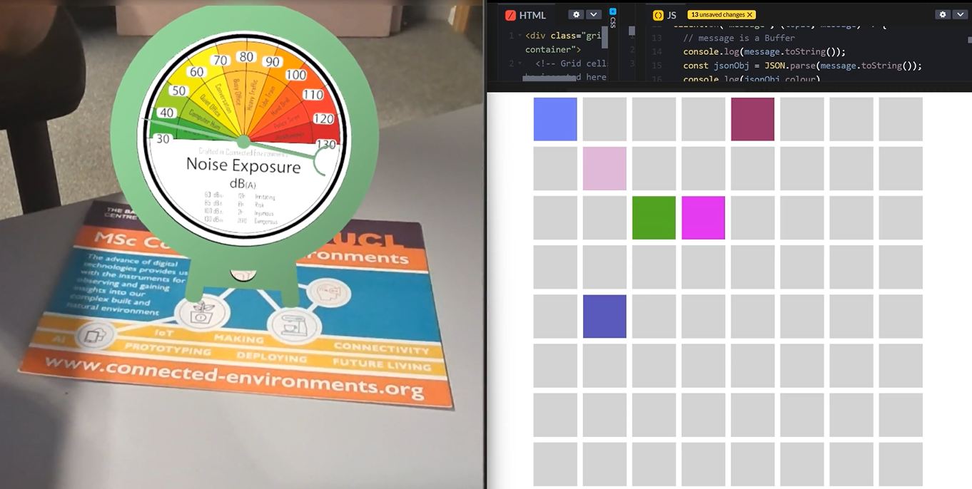
To complete this workshop you will need:
- Visual Studio Code
- Node.js LTS and NPM
- Android SDK Platform Tools
- Chromium-based browser (e.g. Microsoft Edge or Google Chrome)
- Connected Environments Postcard Image Front
- Connected Environments Postcard Image Reverse
- Data Device in GLB format
- Mobile Device (suggested Android for using the WebXR API)
- Workshop 6 completed
Languages used:
- HTML
- JavaScript
Additional resources
When sharing a Babylon.js project, as with many other development projects, not every file and folder needs to be included. Environment files, such as .env, should not be shared because they may contain sensitive information, including API keys or access credentials. The node_modules folder can also be excluded because it contains installed dependencies that can be downloaded again using package.json and the pacakge-lock.json file. Similarly, the dist folder contains generated build output and can usually be recreated from the source files.
create a new folder for this Workshop and add the previous project avoiding .env, node_modules and dist folders
navigate to the folder of the project from the terminal cd [name of your project]
Run npm install to install all the dependencies listed in package.json
When ready, run npm run dev to launch the local development server and access the WebApp from the address and ports listed in the terminal.
A common approach for interacting with digital AR content is through gestures.
In this case, we are going to add two gestures that control the rotation and scale of the digital object on the image target. These gestures can be implemented directly using the browser's native JavaScript Pointer Events API, or by using a library that reduces the amount of code required and keeps the scripts easier to read and maintain.
We are going to use Hammer.js, an older but still very efficient library for handling different types of gestures.
- install the
Hammer.jslibrary
npm install hammerjs
- create a new
gesturesManager.jsin thesrc/utilsfolder
import Hammer from "hammerjs";
import { Quaternion, Axis } from "@babylonjs/core";

// Stores the currently selected mesh
let target = null;
// Stores the Hammer.js gesture manager instance
let hammer = null;

export function initGestureManager(canvas) {

  // Create a Hammer.js manager attached to the canvas
    hammer = new Hammer.Manager(canvas);

// Pinch gesture used for scaling
    const pinch = new Hammer.Pinch({
        threshold: 0,
        pointers:2 //fingers
    });

// Rotation gesture used to rotate the object
    const rotate = new Hammer.Rotate({
        threshold: 0,
        pointers:2 //fingers
    });

    hammer.add([pinch, rotate]);

// Allow pinch and rotate to be recognised simultaneously
    pinch.recognizeWith(rotate);
    rotate.recognizeWith(pinch);

// --------------------------------------------------
// SCALING
// --------------------------------------------------

    let startScale = null;
// Store the object's scale when the gesture begins
hammer.on("pinchstart", () => {

    if (!target) return;

    startScale = target.scaling.clone();

});

// Apply the scaling factor while pinching
   hammer.on("pinchmove", (ev) => {

    if (!target) return;

    const factor = ev.scale;

    target.scaling.set(
        startScale.x * factor,
        startScale.y * factor,
        startScale.z * factor
    );
});

// --------------------------------------------------
// ROTATION
// --------------------------------------------------
let startQuat = null;
let gestureStartRotation = 0;

// Save the initial rotation when the gesture starts
    hammer.on("rotatestart", (ev) => {

    if (!target) return;

    startQuat = target.rotationQuaternion.clone();

    gestureStartRotation = ev.rotation;
});
// Rotate the object around the Y-axis
   hammer.on("rotatemove", (ev) => {

    if (!target || !startQuat) return;

    const deltaAngle =
        ev.rotation - gestureStartRotation;

    const deltaQuat =
        Quaternion.RotationAxis(
            Axis.Y,
            deltaAngle * Math.PI / 180
        );

    target.rotationQuaternion =
        startQuat.multiply(deltaQuat);
});
}

/**
* Sets the mesh that will respond to gestures.
* Usually called after the mesh has been selected.
*/
export function setGestureTarget(mesh) {
    target = mesh;
}

/**
* Removes the current gesture target.
* Subsequent gestures will have no effect.
*/
export function clearGestureTarget() {
    target = null;
}
To use gestures in the application, we need to add the functionality when the model is triggered by the image targets. In this case, the implementation is added inside imageTargetPipeline.js
- At the top of the file, import the gestures functions just created in the
gesturesManager.js
import {
    initGestureManager,
    setGestureTarget,
    clearGestureTarget
} from "./gesturesManager.js";
- To keep track of the gestures state, add two new global variables,
gesturesEnabledandgesturesTarget, immediately after the existing global variables
// Keep a reference to the running Babylon.js application
  let application = null;
// Prevent the scene from being created more than once.
  let started = false;

//Controls if gestures have been enabled or not
  let gesturesEnabled = false;
//Object currently controlled by gestures
  let gesturesTarget = null;
- Inside the
createScene()function, initialise the target object and the gesture manager after the object references have been created:
gesturesTarget = originModel.getChildTransformNodes()[0];
initGestureManager(
  canvas,
  console.log("Gesture manager initialised")
);
Finally, in the onXrImageFoundObservable, inside the target-image conditional that triggers the model, add:
if (gesturesEnabled){
    setGestureTarget(gesturesTarget);
}
- In the
onXrImageLostObservable, inside the the same target-image conditional that triggers the model, add
//Remove the active gesture target when the image is no longer detected
clearGestureTarget();
By setting the global variable gesturesEnabled to true, we will be able to enable gesture controls from the start of the application. In this case, we are going to add a UI that allows users to enable or disable gestures whenever they want.
In some cases, keeping all controls visible works well. However, when extra information or user input are needed, a menu helps keep the interface organised and makes it easier to add new features.
There are many approaches and ready-made libraries available for building menus, depending on the complexity of the interface and the amount of information that needs to be displayed. In this case, we will use a simple solution based entirely based om HTML and CSS.
- In the
index.htmladd before therenderCavasthe following structure
<input type="checkbox" id="menu-toggle" hidden>
    <label for="menu-toggle" id="menu-button" class="hidden">
        <span></span>
        <span></span>
        <span></span>
    </label>

    <div id="menu-panel" class="hidden">
        <div class="menu-header">
            DATA DEVICE
        </div>

        <div class="menu-body">

            <div class="menu-section">
                <div class="menu-section-title">Content</div>
                <label class="menu-row">
                    <input type="checkbox" id="gestures-toggle">
                    <span>Enable Transform</span>
                </label>
            </div>
        </div>
    </div>
- create a new
stylemenu.css
/* ---------- MENU BUTTON ---------- */

#menu-button {
    position: absolute;
    top: 12px;
    right: 16px;

    width: 32px;
    height: 32px;

    display: flex;
    flex-direction: column;
    justify-content: center;
    gap: 5px;

    z-index: 1100;
    cursor: pointer;
}

#menu-button span {
    height: 2px;
    width: 100%;
    background: rgb(255, 255, 255);
    border-radius: 999px;

    transition: .25s ease;
}

/* Animate into X */

#menu-toggle:checked + #menu-button span:nth-child(1) {
    transform: translateY(7px) rotate(45deg);
}

#menu-toggle:checked + #menu-button span:nth-child(2) {
    opacity: 0;
}

#menu-toggle:checked + #menu-button span:nth-child(3) {
    transform: translateY(-7px) rotate(-45deg);
}

/* ---------- FULLSCREEN PANEL ---------- */

#menu-panel {
    position: absolute;
    inset: 0;

    background: rgba(0, 0, 0, .85);
    backdrop-filter: blur(16px);

    z-index: 1050;

    opacity: 0;
    pointer-events: none;

    transition: opacity .25s ease;
}

#menu-toggle:checked ~ #menu-panel {
    opacity: 1;
    pointer-events: auto;
}

/* ---------- HEADER ---------- */

.menu-header {
    height: 56px;

    display: flex;
    align-items: center;
    justify-content: center;

    background: linear-gradient(
        to bottom,
        rgba(0, 0, 0, .8),
        rgba(0, 0, 0, 0)
    );

    color: white;
    font-size: 1rem;
    font-weight: 600;
}

/* ---------- BODY ---------- */

.menu-body {
    padding: 80px 24px 24px;

    color: white;
    font-size: 1rem;
}

/* ---------- SETTINGS CARDS ---------- */

.menu-section {
    display: flex;
    flex-direction: column;
    gap: 12px;

    padding: 16px;
    margin-bottom: 16px;

    border-radius: 16px;

    background: rgba(255, 255, 255, .05);
    backdrop-filter: blur(12px);
}

/* ---------- SECTION TITLE ---------- */

.menu-section-title {
    color: white;
    font-size: 1rem;
    font-weight: 600;
}

/* ---------- SIMPLE ROW ---------- */

.menu-row {
    display: flex;
    align-items: center;
    gap: 12px;

    color: white;
}

.menu-row input[type="checkbox"] {
    width: 18px;
    height: 18px;
}

/* ---------- FORM FIELDS ---------- */

.menu-field {
    display: flex;
    flex-direction: column;
    gap: 4px;

    color: white;
    font-size: 0.9rem;
}

.menu-field input {
    padding: 10px 12px;

    border: none;
    border-radius: 8px;

    background: rgba(255, 255, 255, .10);
    color: white;

    box-sizing: border-box;
}

.menu-field input::placeholder {
    color: rgba(255, 255, 255, .50);
}

.menu-field input:focus {
    outline: none;
    background: rgba(255, 255, 255, .15);
}

/* ---------- BUTTONS ---------- */

.menu-section button {
    padding: 10px 12px;

    border: none;
    border-radius: 8px;

    background: rgba(255, 255, 255, .15);
    color: white;

    cursor: pointer;

    transition:
        background .2s ease,
        transform .1s ease;
}

.menu-section button:hover {
    background: rgba(255, 255, 255, .25);
}

.menu-section button:active {
    transform: scale(.98);
}
- import the new style in the
index.js
import "./stylemenu.css"
- To connect the checkbox to the JavaScript functionality, add the following code immediately after the
initGestureManager()call inimageTargetPipeline.js
 document.getElementById("gestures-toggle")
    .addEventListener("change", (event) => {
        gesturesEnabled = event.target.checked;
        if (
            gesturesEnabled &&
            gesturesTarget &&
            originModel.isEnabled()
        ) {
            setGestureTarget(gesturesTarget);
        }
        else {
            clearGestureTarget();
        }
    });
To prevent the menu from being visible before the AR system is ready, we can use the same approach as before by controlling the visibility of both the menu-button and the menu-panel.
- In
imageTargetPipeline.js, after theawait startScene()line inside theasync function onStart()
await startScene();

// The AR experience is ready and running
document.getElementById("onboarding-panel").classList.remove("hidden");
document.getElementById("top-bar").classList.remove("hidden");

//Add the new menu elements
document.getElementById("menu-button").classList.remove("hidden");
document.getElementById("menu-panel").classList.remove("hidden");
The code listens for changes to the checkbox with the ID gestures-toggle. When the user enables the checkbox, the value of gesturesEnabled is updated to true or false. If gestures are enabled, a valid gesture target exists, and the tracked model is currently visible, the gesture controller is attached to the target object through setGestureTarget(). Otherwise, the gesture controller is removed using clearGestureTarget().
Another use of the menu in the WebApp is to allow the user to submit data. In this workshop, we will see how to use forms to publish data to a password-protected MQTT broker, enabling users to interact with an external service through the digital model.
- In
index.html, add the following newmenu-sectioninside themenu-bodydiv, immediately after the existingmenu-sectionthat controls gesture settings.
<div class="menu-section">
  <div class="menu-section-title">
    MQTT Connection
  </div>
  <div class="mqtt-status disconnected" id="mqtt-status">
    <span class="mqtt-dot"></span>
    <span class="mqtt-label">Disconnected</span>
  </div>

  <form id="mqtt-form">
    <label class="menu-field">
      <span>Broker Address</span>
      <input type="text" id="mqtt-broker" placeholder="broker.address">
    </label>

    <label class="menu-field">
      <span>User ID</span>
      <input type="text" id="mqtt-user" autocomplete="username">
    </label>

    <label class="menu-field">
      <span>Password</span>
      <input type="password" id="mqtt-password" autocomplete="current-password">
    </label>

    <button type="button" id="mqtt-connect">
      Connect
    </button>

    <button type="button" id="mqtt-disconnect">
      Disconnect
    </button>
  </form>
</div>
- Add the specific styles for
mqtt-statusto the existingstylemenu.cssfile
/* Specific styles */
.mqtt-status {
    display: flex;
    align-items: center;
    gap: 8px;
    margin-bottom: 12px;
    color: white;
    font-size: 0.9rem;
}

.mqtt-dot {
    width: 10px;
    height: 10px;
    border-radius: 50%;
    background: #ff4d4d;
}

.mqtt-status.connected .mqtt-dot {
    background: #2ecc71;
}

.mqtt-status.disconnected .mqtt-dot {
    background: #ff4d4d;
}
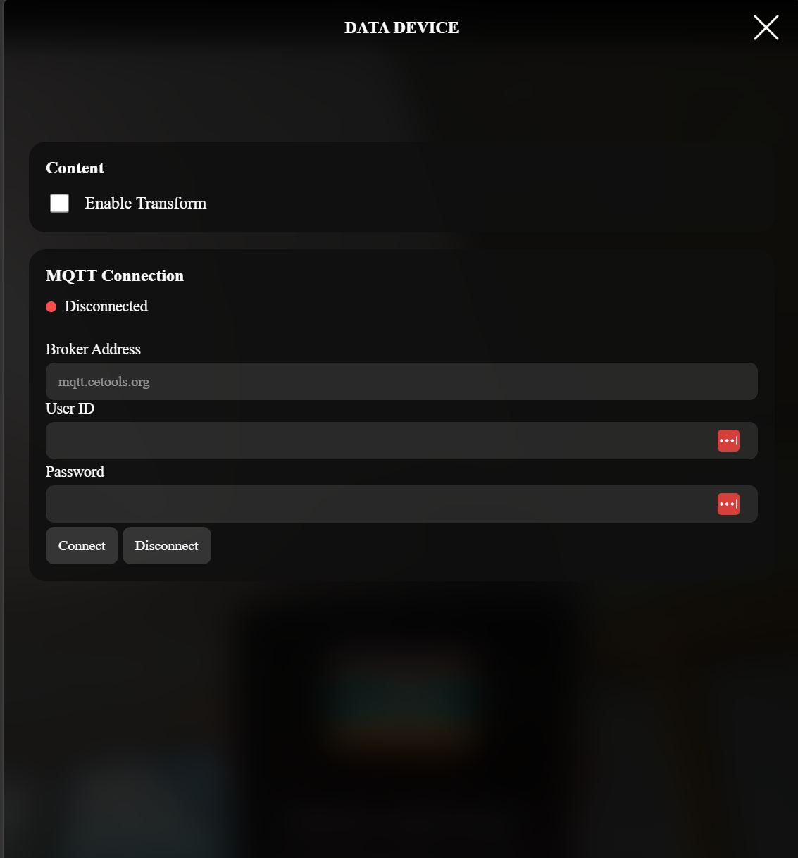
The current web application already creates a connection to subscribe to the topic that controls the rotation of the data device pointer (mqttController.subscribeToTopic). Rather than using that existing connection to publish messages to the broker, which is of course possible and, in some cases, recommended to avoid creating duplicate connections, in this workshop we will create a second, authenticated connection to the same broker.
- In
imageTargetPipeline.js, locate theconst mqttController = createMQTTController(...)statement inside thestartScene()function - Immediately after it, create a new MQTT controller instance with a different name
mqttPublisher
const mqttPublisher = createMQTTController({
autoConnect: false
});
We are going to let the user to enter the broker address, username, and password through a form in the menu. In this example, we also set autoConnect to false. This means that the connection will not be established automatically when the application starts. Instead, the user will need to click the Connect button after entering the required connection details.
This behaviour is implemented using the following code, which need to be added immediately after the mqttPublisher object that was just created
// Add a click event listener to the Connect button.
// When pressed, the application will attempt to establish
// a new MQTT connection using the values entered in the form.
document.getElementById("mqtt-connect")
    .addEventListener("click", () => {

        // Update the interface while the connection is being established
        updateStatus("connecting");

  // Read the broker address, username and password
  // from the form and use them to connect
        mqttPublisher.connect(
            document.getElementById("mqtt-broker").value,
            document.getElementById("mqtt-user").value,
            document.getElementById("mqtt-password").value,
            {
                // When Connection successful
                onConnect: () => updateStatus("connected"),

                // When Connection closed
                onDisconnect: () => updateStatus("disconnected"),

                // When Connection error
                onError: () => updateStatus("disconnected")
            }
        );
    });


// Disconnect from the MQTT broker when requested by the user
document.getElementById("mqtt-disconnect")
    .addEventListener("click", () => {

        mqttPublisher.disconnect();
        // Update the user interface
        updateStatus("disconnected");
    });


// Updates the visual connection status shown in the menu.
// The status can be "connecting", "connected" or "disconnected"
function updateStatus(status) {
    const statusElement = document.getElementById("mqtt-status");
    // Exit if the status indicator is not available
    if (!statusElement) {
        return;
    }
    const label = statusElement.querySelector(".mqtt-label");

    // Remove any previously applied status class
    statusElement.classList.remove(
        "connected",
        "disconnected",
        "connecting"
    );

  // Apply the new status class. This can be used by CSS
  // to change colours, icons or other visual indicators.
    statusElement.classList.add(status);

    // Display a readable version of the status text,
    // for example "Connected" instead of "connected". So yes, this just make the capital letter
    label.textContent =
        status.charAt(0).toUpperCase() +
        status.slice(1);
}
- The final part is the actual message to be published. In this case, it is triggered by
target-image2
if (event.name === 'target-image2') {

if(mqttPublisher.isConnected()){
  mqttPublisher.publish(
      "student/grid",
      JSON.stringify({
          myName: "vale",
          row: Math.floor(Math.random() * 6) + 1,
          row: Math.floor(Math.random() * 6) + 1,
          column: Math.floor(Math.random() * 6) + 1,
          colour:
                  `${Math.floor(Math.random() * 256)},` +
                  `${Math.floor(Math.random() * 256)},` +
                  `${Math.floor(Math.random() * 256)}`
      })
  );
}
}
To avoid exposing the password required to authenticate with the MQTT broker, to trigger MQTT publish messages you will need to open the menu and provide broker address, username and password. The broker address can be hardcoded if required.
Publish the Message Using Raycasting
Currently, the message is published as soon as the image target is detected. Instead, implement a raycasting-based interaction, similar to the approach introduced in Workshop 2, so that the message is sent only when the user selects a specific object.
Create an Input Form for Custom Messages
Create an input form that allows users to enter a custom message and submit it to the online service.