This workshop will show you how to:
- Create interactive visualisations using DeckGL
- Use vector map providers MapLibre, CARTO
- Import and visualise spatial datasets
- Query and interact with the map's features
- Create and embed charts
- Use real time API
- Build and publish your website
To complete this workshop you will need:
- Visual Studio Code
- Live Server for VS Code
- Node.js LTS and NPM
- Free GitHub Account
- Free MapTiler Account
- Free Cesium ION Credential to use 3D tiles
Resources and Geodata
- DeckGL Documentation
- MapLibre API Reference
- EChart Documentation
- World countries polygons, ne_50m_admin_0_countries.geojson
- Most populated places, ne_10m_populated_places_simple.geojson
- World Airports, ne_10m_airports.geojson
- Russell Square area, RussellSquare.geojson
- BatSensors
- Trees in Camden GeoJSON dataset
- Low Poly Tree digital model GLB version. Source Sketchfab
- CityBikes API
Languages used:
- HTML
- JavaScript
There are several approaches to developing and deploying web-mapping visualizations. These range from an immediate method using pure JavaScript and HTML, where entire libraries are loaded in the head of the page, to more contemporary methods employing frameworks like React, Angular, and Vue.js.
In this workshop, we are not going to use any of the above frameworks, but we will explore the use of JavaScript modules that allow us import only the code (the module) we need, rather than entire libraries, helping in keeping a cleaner, more maintainable, and faster code.
We will be using ViteJS, a frontend build tool for web projects. ViteJS is designed to offer an instant server start and features on-demand file serving over native ES modules eliminating the need for bundling during development. For production, it bundles code with Rollup, ensuring highly optimized static assets.
Let's begin by creating a new folder on our system and opening it in VSCode.
- from the top menu, select
Terminal -> New Terminal - type
npm create vite@latest
Provide a name for the project, ViteJS will create a folder with the same name;
Select the framework Vanilla;
Select the variant JavaScript;
do not use the Experimental features;
Finally, Install with npm and start now? No
Navigate to the folder you just created, as instructed in the terminal, and run npm install. NPM will download the packages needed to run a basic version of ViteJS and a sample webpage. To see this in action, execute the command npm run dev. This will launch ViteJS in developer mode with a local server accessible from the local network at the address http://localhost:5173/. Open this address in any browser to see the webpage. The port number may differ if it is already in use by another service.
In addition to the basic packages, we now need to install some additional libraries that we will use in this workshop:
@deck.gl/core@deck.gl/cartomaplibre-gl@deck.gl/layers@deck.gl/mapbox
Exit the local server by pressing CTRL+C with the Terminal on focus. We can download all of them in one go with the following command:
npm install "@deck.gl/core" "@deck.gl/carto" maplibre-gl "@deck.gl/layers" "@deck.gl/mapbox"
We are now ready to develop our web visualization. We might need to install additional packages later on, but the ones listed above provide a solid starting point.
DeckGL is a WebGL-powered framework for visual exploratory data analysis of large datasets. Based on Luma.GL, DeckGL provides high-performance visualisations of large datasets using GPU computation and a Layer Approach.
In this first section, GeoJsonLayer, ScatterplotLayer and TextLayer will be used. Execute the command npm run dev in the terminal to start the local server.
To get started with DeckGL, select the index.html file. Add an element div with id="map" as child of another element div with id="container" inside the existing div with id="app".
<!doctype html>
<html lang="en">
<head>
  <meta charset="UTF-8" />
  <meta name="viewport" content="width=device-width, initial-scale=1.0" />
  <title>Mapping</title>
</head>
<body>
  <div id="app">
    <div id="container">
      <div id="map"></div>
    </div>
    <script type="module" src="/src/main.js"></script>
</body>
</html>
We need to update the style.css file, remove all the content and add the following minimal style
body {
margin: 0;
padding: 0;
}

#container {
position: fixed;
top: 0;
left: 0;
right: 0;
bottom: 0;
}

#map {
position: absolute;
top: 0;
bottom: 0;
width: 100%;
}
The next step is to add the JavaScript code to initialize a basemap, in this case provided by CARTO and served by MapLibre.
Among the parameters that are used to visualise the basemap we have the style, the center of the map, as an array of longitude and latitude and the zoom of the map itself.
We are going to use the file main.js that has been created by Vitejs. Delete all the content except the first line import './style.css' and save the file. You'll notice that the page in the browser, if the live server is running, will be completely blank. This is because Vitejs provides a function of hot reload that shows immediately the content of the code we are writing.
import './style.css'
import { BASEMAP } from '@deck.gl/carto';
import { Map } from 'maplibre-gl';
import 'maplibre-gl/dist/maplibre-gl.css';

//Initialise Maplibre BaseMap
const map = new Map({
  container: 'map',
  style: BASEMAP.POSITRON,
  interactive: true,
  center:[-0.12262486445294093,51.50756471490389],
  zoom: 12
})
Let's add some data. DeckGL uses a Layer Approach to visualise data. The layers are passed in form of array to the parameters of the DeckGL object:
In order to overlay a DeckGL layer over the MapLibre basemap we need to use the MapboxOverlay module. In this example we are going to use a ScatterplotLayer to place a circle at the centre of the map.
While the layers can be added directly to the layers array, it is more effective and easier to manage, especially as the number of layers grows—by, to first declaring the layer and then adding it to the array.
import './style.css'
import { BASEMAP } from '@deck.gl/carto';
import { Map } from 'maplibre-gl';
import 'maplibre-gl/dist/maplibre-gl.css';

import { MapboxOverlay } from '@deck.gl/mapbox';
import { ScatterplotLayer } from '@deck.gl/layers';

//Initialise Maplibre BaseMap
const map = new Map({
  container: 'map',
  style: BASEMAP.POSITRON,
  interactive: true,
  center:[-0.12262486445294093,51.50756471490389],
  zoom: 12
})

//before loading any data, wait until the map is fully loaded
await map.once('load');

//Declaring the layers
let layerCircle = new ScatterplotLayer({
      id: 'deckgl-circle',
      data: [
        {position: [-0.12262486445294093,51.50756471490389]},
      ],
      getPosition: d => d.position,
      getFillColor: [242, 133, 0, 200],
      getRadius: 1000,
    })

//Overlay DeckGL layers on MapLibre: Overlaid - Deckgl on a separate element | Interleaved - Same WebGL context
const deckOverlay = new MapboxOverlay({
  interleaved: true,
  layers: [
    layerCircle
  ]
});

map.addControl(deckOverlay);
In this case the layer is going to be added on top of all the basemap features (e.g. labels and lines). If we want to place the layer behind the labels, or behind the roads, we can use the parameter beforeID, and to find the ID of the feature we can use the following function, just after the await map.once('load');
const layers = map.getStyle().layers;
// Find the index of the first symbol layer in the map style.
let firstSymbolId;
for (const layer of layers) {
  if (layer.type === 'symbol') { //symbol for labels; line for roads; more here https://maplibre.org/maplibre-style-spec/layers/#type
    firstSymbolId = layer.id;
    console.log(firstSymbolId);
    break;
  }
}

//Declaring the layers
let layerCircle = new ScatterplotLayer({
      id: 'deckgl-circle',
      data: [
        {position: [-0.12262486445294093,51.50756471490389]},
      ],
      getPosition: d => d.position,
      getFillColor: [242, 133, 0, 200],
      getRadius: 1000,
      beforeId: firstSymbolId // In interleaved mode render the layer under map labels
    })

//Overlay DeckGL layers on MapLibre: Overlaid - Deckgl on a separate element | Interleaved - Same WebGL context
const deckOverlay = new MapboxOverlay({
  interleaved: true,
  layers: [
   layerCircle
  ]
});

map.addControl(deckOverlay);
Now the circle is rendered behind the labels
Another common way to load data into our visualisation is to use GeoJson datasets and the GeoJsonLayer, as it is part of the Core layers we can added it to the ScatterplotLayer import.
import { ScatterplotLayer,GeoJsonLayer } from '@deck.gl/layers';
The first dataset we are going to use, ne_50m_admin_0_countries.geojson, contains the world countries in form of polygons; the second dataset, ne_10m_populated_places_simple.geojson, is used to visualise, in form of points, the most populated places on earth:
map.addControl(deckOverlay);

const COUNTRIES = 'https://raw.githubusercontent.com/nvkelso/natural-earth-vector/master/geojson/ne_50m_admin_0_countries.geojson'
const POPULATION = 'https://raw.githubusercontent.com/nvkelso/natural-earth-vector/master/geojson/ne_10m_populated_places_simple.geojson'

//Declaration of the layers, in case we need to add them later
//Polygon layer in GeoJson
    let layerCountries = new GeoJsonLayer({
      id: 'base-map', //every layer needs to have a unique ID
        data: COUNTRIES, //data can be passed as variable or added inline
        // Styles
        stroked: true,
        filled: false,
        lineWidthMinPixels: 2,
        opacity: 0.7,
        getLineColor: [252, 148, 3], //RGB 0 - 255
        //getFillColor: [79, 75, 69],
      beforeId: firstSymbolId // In interleaved mode the layer is rendered under map's labels
    })

    //Point layer in GeoJson
    let layerPopulation = new GeoJsonLayer({
      id: 'deckgl-population',
      data:POPULATION,
      dataTransform: data => data.features.filter(filteredData => filteredData.properties.featurecla === 'Admin-0 capital'),
        // Styles
        filled: true,
        pointRadiusScale: 10,
        getPointRadius: filteredData => filteredData.properties.pop_max / 1000,
        getFillColor: [200, 0, 80, 190],
      beforeId: firstSymbolId, // In interleaved mode the layer is rendered under map's labels
    })

//Layers in DeckGL can be updated using setProps. This operation removes any previous layers if they are not carried over using ...deckOverlay._props.layers
deckOverlay.setProps({
  layers: [
   ...deckOverlay._props.layers, //carry over the initial layers
  layerCountries,
  layerPopulation

  ]
})
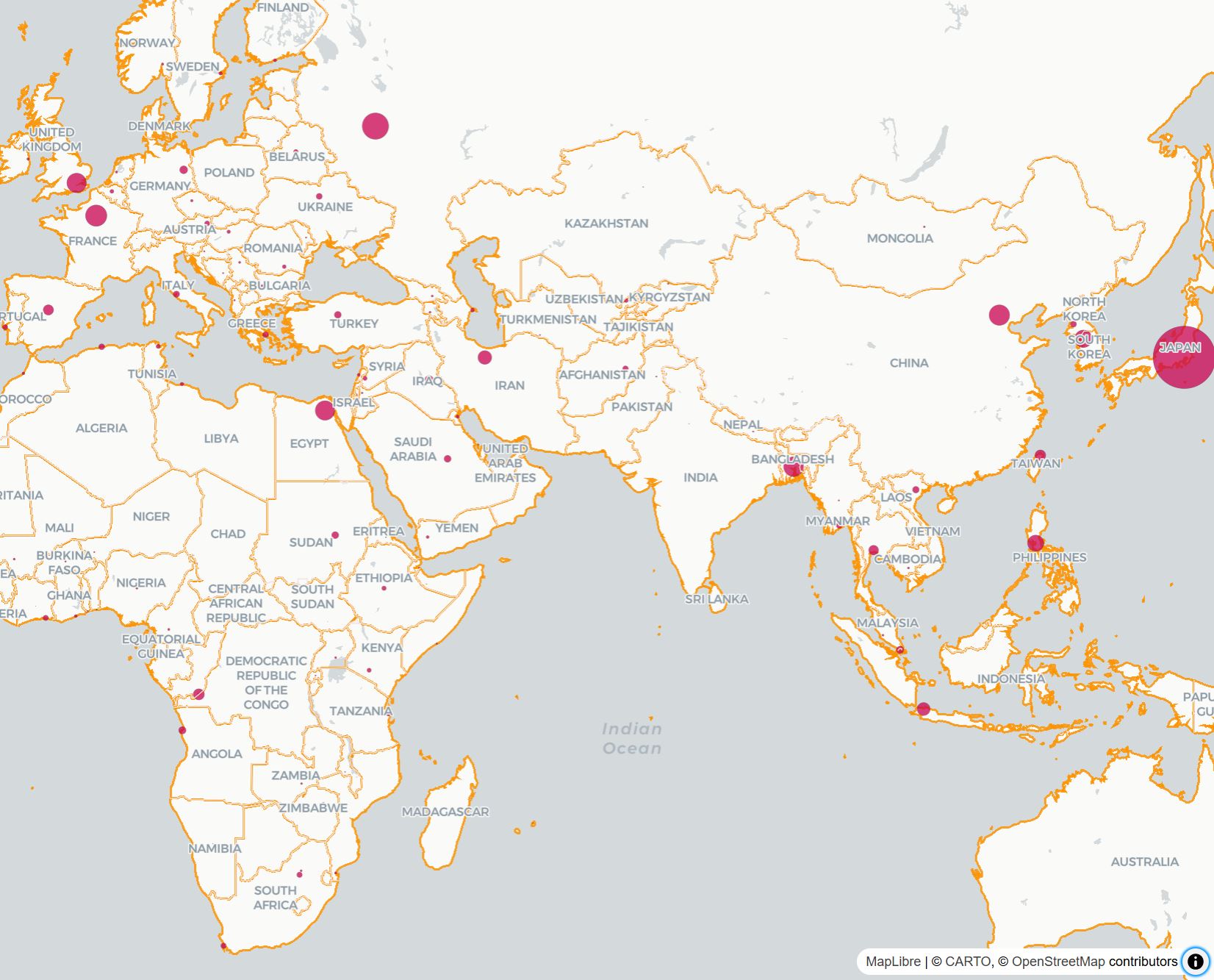
The result is a base map of the world overlayed to the MapLibre basemap and a series of circle showing the population of the capital cities. Using Deck.GL it is possible transform the data on-the-fly using the dataTransform. In this example using arrows functions
dataTransform: data => data.features.filter(filteredData => filteredData.properties.featurecla === 'Admin-0 capital'),
If we are not sure about the result of the dataTransform, we can use the console.log function to print in the console the content of the data.features. This is possible by changing the syntax of the arrow function
dataTransform: data=>{ console.log(data.features); return data.features.filter(filteredData => filteredData.properties.featurecla === 'Admin-0 capital')},
the features are filtered by countries' capitals, and by using
getPointRadius: filteredData => filteredData.properties.pop_max / 1000,
the radius of the buffer is created according to the population value of the city (divided by 1000 for visualisation reasons).
Another common layer is the TextLayer used to add labels to the map features and part as well of the Core Layers
import { ScatterplotLayer, GeoJsonLayer, TextLayer} from '@deck.gl/layers';
    //Text Layer of the Population
    let layerTextPopulation = new TextLayer({
          id: 'text-layer',
          data: POPULATION,
          dataTransform: d => d.features.filter(f => f.properties.featurecla === 'Admin-0 capital'),
          getPosition: f => f.geometry.coordinates,
          getText: f => { return f.properties.pop_max.toString(); },
          getSize: 22,
          getColor: [0, 0, 0, 180],
          getTextAnchor: 'middle',
          getAlignmentBaseline: 'bottom',
          fontFamily: 'Gill Sans',
          background: true,
          getBackgroundColor: [255, 255, 255,180]
      })

    deckOverlay.setProps({
    layers: [
      //[...] Previous layers
      layerTextPopulation
        ]
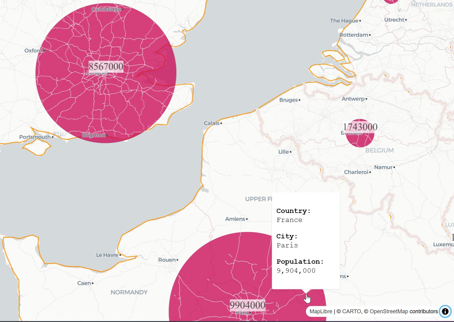
In cases where there is extensive data to display, it is more effective to use a pop-up element on top of the map. The Popup function from MapLibre provides a solid starting point and allows further customization.
Add to the Popup module to the import { Map } from 'maplibre-gl';.
import { Map, Popup } from 'maplibre-gl';
To use the Popup function, we need to set the layer that we want to interact with by using the parameter pickable: true. Also, to provide better feedback to the user, we can dynamically change the type of pointers visualized when the user hovers over an interactable object
- add the
pickable:trueparameter to the population layer and the onHover and onClick functions
let layerPopulation = new GeoJsonLayer({
  id: 'deckgl-population',
  data:POPULATION,
  dataTransform: d => d.features.filter(f => f.properties.featurecla === 'Admin-0 capital'),
  filled: true,
    pickable: true,
  pointRadiusScale: 10,
  getPointRadius: f => f.properties.pop_max / 1000,
  getFillColor: [200, 0, 80, 190],
  beforeId: firstSymbolId, //In interleaved mode the layer is rendered under map's labels
//onHover is used here just to change the pointer
 onHover: info => {
      const {coordinate, object} = info;
      if(object){map.getCanvas().style.cursor = 'pointer';}
      else{map.getCanvas().style.cursor = 'grab';}
    },
  onClick: (info) => {
      console.log(info);
      const {coordinate, object} = info;
      let population=object.properties.pop_max;
      population= population.toLocaleString(); // toLocaleString convert number into string based on the system language
      const description = `<div>
      <p><strong>Country:</strong><br>${object.properties.adm0name}</p>
      <p><strong>City:</strong> <br>${object.properties.ls_name}
      </p><strong>Population:</strong><br>${population}</p>
      </div>`;
      //MapLibre Popup
      new Popup({closeOnClick: false, closeOnMove:true})
          .setLngLat(coordinate)
          .setHTML(description)
          .addTo(map);
    },
    }),
We also need to add a line at the very bottom of our code to fix a visualisation issue with DeckGL
map.__deck.props.getCursor = () => map.getCanvas().style.cursor;
It is possible to customise the appearance of the popup by adding to the style.css the following style
/* Deck.gl layer is added as an overlay, popup needs to be displayed over it */
.maplibregl-popup {
  z-index: 2;
  max-width: 400px;
  min-width: 150px;
  font-size:16px;
  font-family: 'Courier New', Courier, monospace;
}
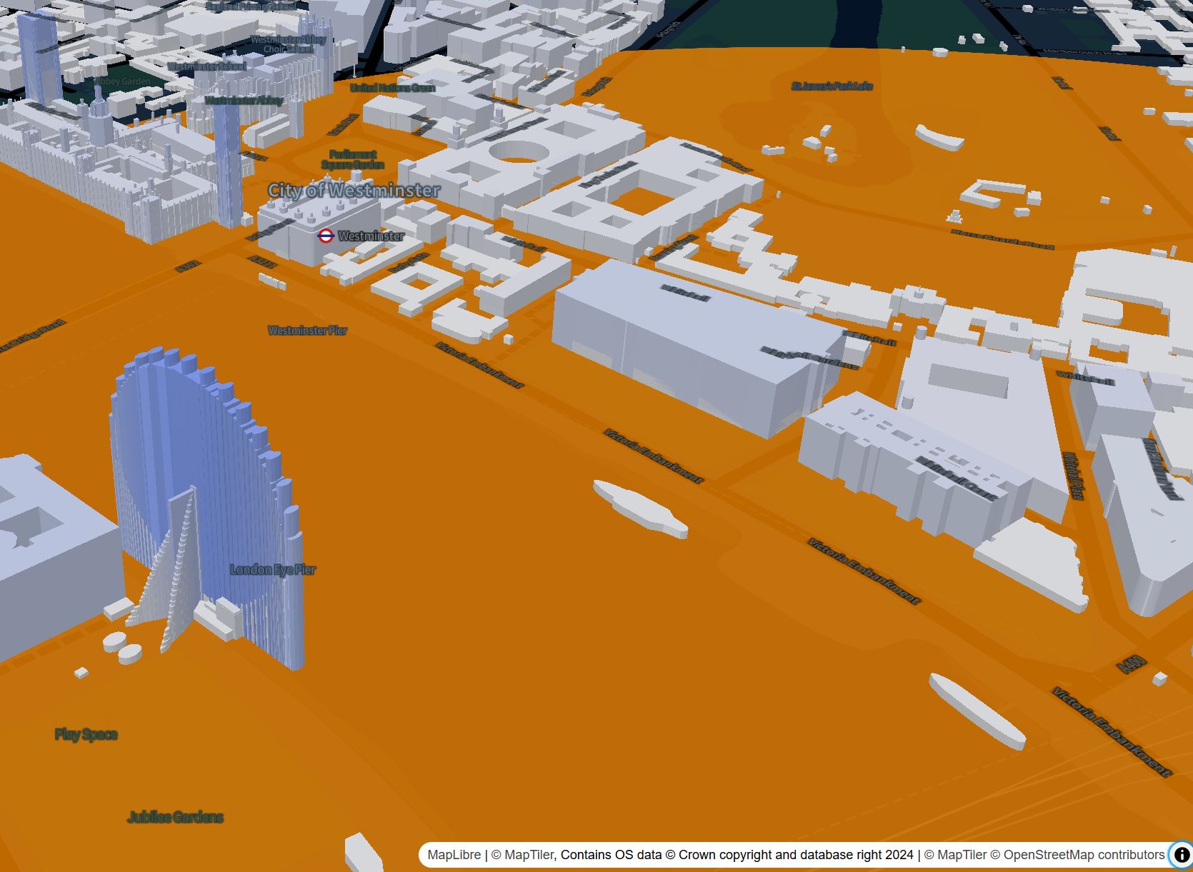
Depending on the vector layers we can access, it is possible to enable additional features and forms of visualization. In this case, we are going to use the vector tiles from MapTiler to visualize 3D buildings.
In order to use MapTiler vector maps, we need to sign up for a free account and obtain an API token.
From the MapTiler cloud dashboard create a new API Key.
In the main.js add before of the const map the MapTiler token and change the style of the map
const MAPTILER_KEY = 'get_your_own_API_token';

//Initialise Maplibre BaseMap
const map = new Map({
  container: 'map',
  style: `https://api.maptiler.com/maps/basic-v2/style.json?key=${MAPTILER_KEY}`,
  interactive: true,
  center:[-0.12262486445294093,51.50756471490389],
  zoom: 12
})
We can now add the source tile that contains the buildings height from OpenStreetMap
map.addSource('openmaptiles', {
  url: `https://api.maptiler.com/tiles/v3/tiles.json?key=${MAPTILER_KEY}`,
  type: 'vector',
});

map.addLayer(
  {
      'id': '3d-buildings',
      'source': 'openmaptiles',
      'source-layer': 'building',
      'type': 'fill-extrusion',
      'minzoom': 10,
      'filter': ['!=', ['get', 'hide_3d'], true],
      'paint': {
          'fill-extrusion-color': [
              'interpolate',
              ['linear'],
              ['get', 'render_height'], 0, 'lightgray', 200, 'royalblue', 400, 'lightblue'
          ],
          'fill-extrusion-height': [
              'interpolate',
              ['linear'],
              ['zoom'],
              15,
              0,
              16,
              ['get', 'render_height']
          ],
          'fill-extrusion-base': ['case',
              ['>=', ['get', 'zoom'], 16],
              ['get', 'render_min_height'], 0
          ]
      }
  },
  firstSymbolId
);
Custom models can be added also using the GeoJsonLayer. Add RussellSquare.geojson to the resources folder of the website. Create a new MapboxOverlay of type GeoJsonLayer and point the getElevation function to the value of the elevation of the GeoJSON file (in this case properties._mean)
 let layerRussellSquareModel = new GeoJsonLayer({
      id:`russellsquare`,
      data: './RussellSquare.geojson',
      pickable: true,
      filled: true,
      extruded: true,
      autoHighlight: true,
      getFillColor: [238,231,215, 255],
      getElevation: d=>d.properties._mean, //User generated from QGis
    }),
// vite.config.js
import basicSsl from '@vitejs/plugin-basic-ssl'
export default ({
  plugins: [
    basicSsl()
  ]
});
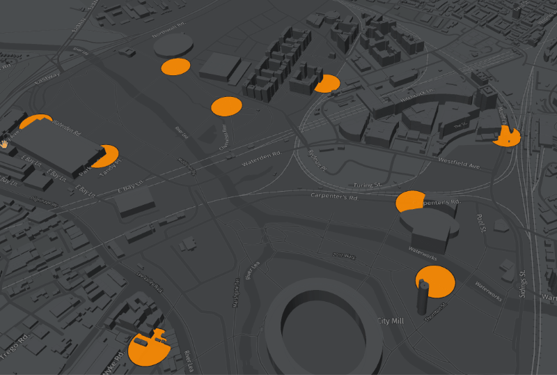
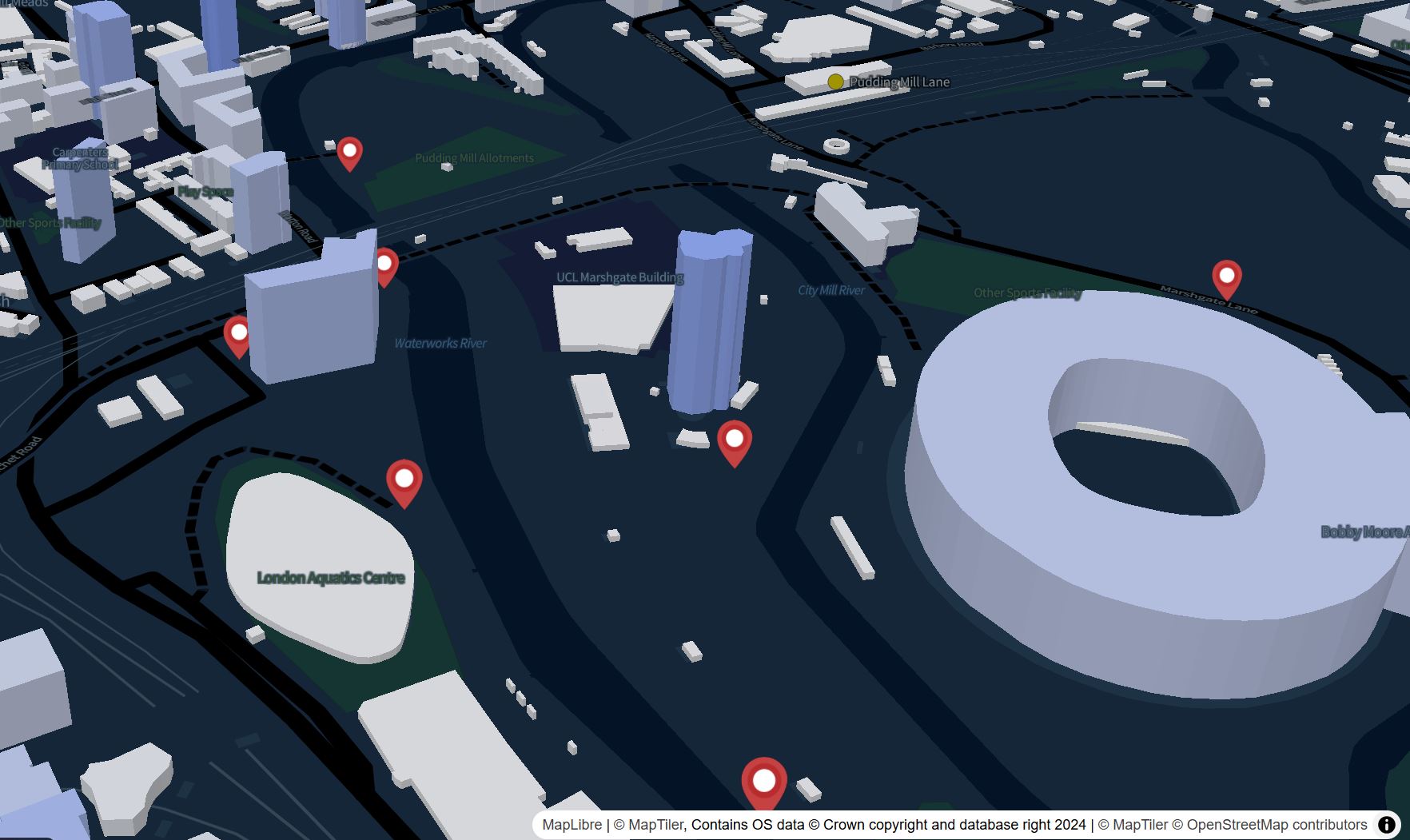
Another common feature on web maps are markers used to highlight specific locations or POI. In DeckGL, these can be easily added using the IconLayer.
import { IconLayer } from '@deck.gl/layers';
While it is possible to provide the location of each marker directly from the layer using an array, it is more efficient to import a GeoJSON file.
layers: [
  //[..other layers..]
new IconLayer({
  id:'icons',
  pickable:true,
  data:'./location.geojson',
  dataTransform:d=>d.features.filter(f=>f.geometry !=null), //just be sure that every feature has a geometry
  getPosition:f=>f.geometry.coordinates,
  getIcon: d => 'marker', //need to match the key in `iconMapping`
  getSize: 35,
  iconAtlas: 'https://upload.wikimedia.org/wikipedia/commons/e/ed/Map_pin_icon.svg',
  iconMapping: {marker: {x: 0, y: 0, width: 94, height: 128, anchorY: 128, mask:false}},
  }),
    ]
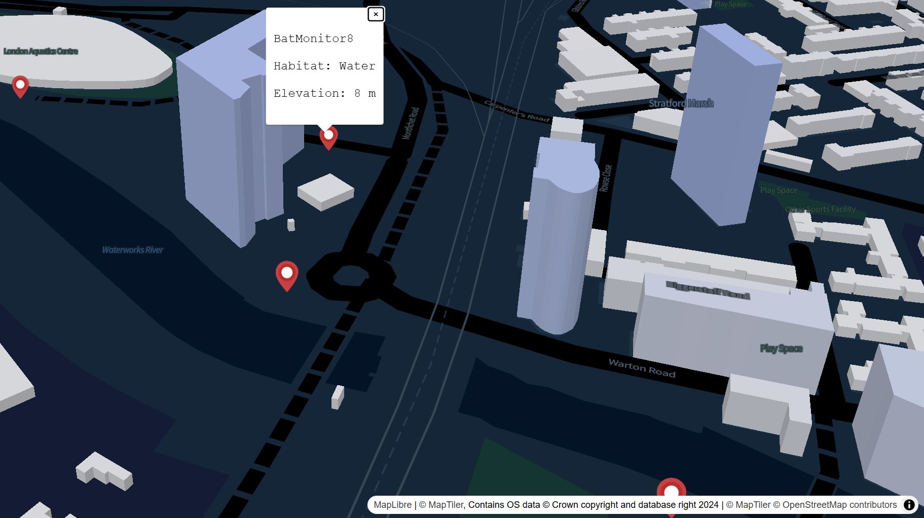
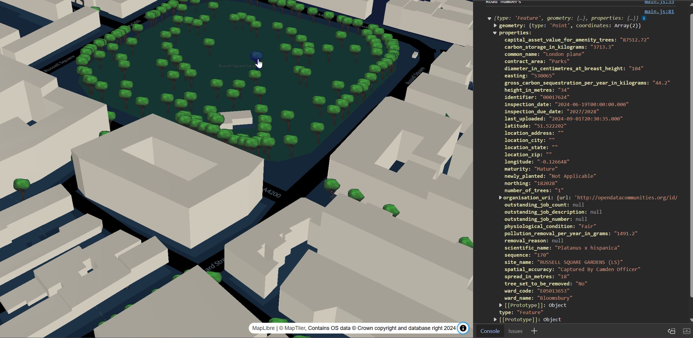
If we open the sample dataset in VSCode we will notice that it has further properties that can be display using a the Popup module. In the IconLayer add the onHover and onClick functions after the iconMapping property
iconMapping: {marker: {x: 0, y: 0, width: 94, height: 128, anchorY: 128, mask:false}},
//onHover is used here just to change the pointer
onHover: info => {
  const {coordinate, object} = info;
    if(object){
      map.getCanvas().style.cursor = 'pointer';
    }
    else{
      map.getCanvas().style.cursor = 'grab';}
    },
onClick: (info) => {
    console.log(info);
    const {coordinate, object} = info;
    const description = `<div>
      <p>${object.properties.Name?object.properties.Name:""}<br></p>
      <p>${object.properties.Habitat?("Habitat: "+object.properties.Habitat):""}<br></p>
      <p>${object.properties.altitude?("Elevation: "+object.properties.altitude+" m"):""}<br></p>
      </div>`;
//MapLibre Popup
    new Popup({closeOnClick: false, closeOnMove:true})
    .setLngLat(coordinate)
    .setHTML(description)
    .addTo(map);
  }
When working with large datasets, it is useful to provide a filtering option to allow users to highlight specific portions of the data. The filtering operation can be performed on the server-side or, as we will see now, on the client-side. The filtering operation can be applied to most DeckGL layers, with some exclusions.
We are going to visualize the trees in the borough of Camden using an IconLayer and then perform data filtering based on specific criteria.
As first step, we need to add the dataset at the top of the main.js file
const CamdenTrees= 'https://opendata.camden.gov.uk/resource/csqp-kdss.geojson?$limit=50000' //limit attribute is needed to get all the data more info on https://dev.socrata.com/docs/queries/limit.html
Declare a new iconlayer, just before the const deckOverlay = new MapboxOverlay({}), and add it to the array,
let CamdenTreesLayer=new IconLayer({
      id:'camdentreesicons',
      data:CamdenTrees,
      pickable: true,
      // iconAtlas and iconMapping are required
      iconAtlas: 'https://upload.wikimedia.org/wikipedia/commons/b/ba/Icon_Tree_256x256.png',
      iconMapping: {marker: {x: 0, y: 0, width: 256, height: 256, anchorY: 256, mask: false}},
      billboard: true,
      dataTransform: d => d.features.filter(f => f.geometry !=null),
      getPosition: d => d.geometry.coordinates,
      getIcon: d => 'marker',
      sizeScale: 10,
      getSize: d => 5,
      getColor: d => [120, 140, 0],
      pickable: true,
      autoHighlight: true,
      //onHover is used here just to change the pointer
onHover: info => {
  const {coordinate, object} = info;
    if(object){
      map.getCanvas().style.cursor = 'pointer';
    }
    else{
      map.getCanvas().style.cursor = 'grab';
  }
    },
      onClick: info => console.log(info.object),

    })
Once the Layers are defined, they can be added to the MapboxOverlay array and to the map
const deckOverlay = new MapboxOverlay({
  interleaved: true,
  layers: [
    //[other layers],
    LayerCamdenTrees,
  ]
});
After the map.addControl, we set the icon to be visible just in a certain range of zoom.
map.addControl(deckOverlay);
map.setLayerZoomRange('camdentreesicons', 15, 20); //visualise the layer between zoom 15 and 20
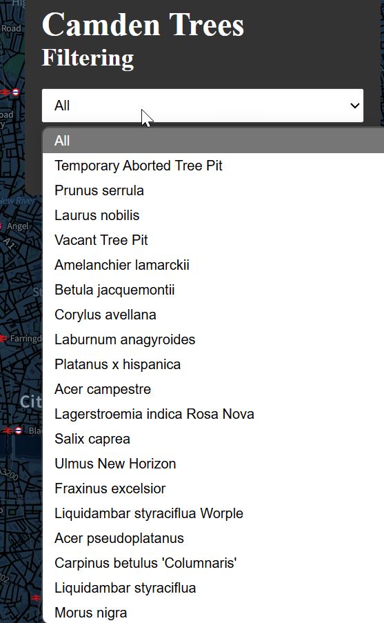
Filtering
The filtering operation is used to display specific features of the dataset we intend to visualize. There are various methods to control the data in the visualization. In this case, we will use a dropdown menu to select the current condition of trees. The filtering features in DeckGL are not part of the standard layers and need to be installed by importing the following module.
npm install @deck.gl/extensions
at this point we can add it to the imports
import { DataFilterExtension } from '@deck.gl/extensions';
In the index.html create a simple dropdown menu by adding the following html just after the div id='map
      <div id="control-card"><!-- container of the drowdown menu -->
        <h1>Camden Trees</h1>
        <h2>Filtering</h2>
        <select id="family-dropdown"> <!-- drowdown menu -->
          <option value="all">All</option> <!-- first option -->
          <!-- All the other options are added via js -->
        </select>
      </div>
and add the styles to the style.css
/*Control menu*/
#control-card {
  position: absolute;
  top: 10px;
  right: 10px;
  z-index: 1;
  width: 344px;
  height: 200px;
  background-color: #333; /* Dark gray background */
  color: white; /* White text */
  padding: 16px;
  box-sizing: border-box;
  border-radius: 8px; /* Optional: for rounded corners */
}

#control-card h1,
#control-card h2 {
  margin: 0;
  padding: 0;
}

#control-card select {
  width: 100%;
  padding: 8px;
  margin-top: 16px;
}
Finally, in the main.js file, we can add a function at the beginning, before the initialization of the map, to read the content of the GeoJSON dataset. The file will be read using the fetch function. Each physiological_condition entry will be added to an array, if it doesn't already exist to avoid duplicates. These features will then be used to create the entry for the dropdown menu using the dropdown.appendChild(option); function.
let addArray=[]
await loadJsonAndPopulateDropdown()
// Function to fetch and process the JSON file
function loadJsonAndPopulateDropdown() {
  fetch(CamdenTrees)
    .then(response => response.json())
    .then(data => {
      const dropdown = document.getElementById('family-dropdown');

      console.log(data);
      data.features.forEach(item => {
          if (item.properties.physiological_condition && !addArray.includes(item.properties.physiological_condition)) {
          addArray.push(item.properties.physiological_condition);
          const option = document.createElement('option');
          option.value = item.properties.physiological_condition;
          option.textContent = item.properties.physiological_condition;
          dropdown.appendChild(option);
        }
      });
      console.log(addArray);
    })
    .catch(error => console.error('Error loading JSON:', error));
}
To trigger the filtering operation we need to add, the to CamdenTrees IconLayer, the following properties before the onHover function
getFilterCategory:d=> d.properties.physiological_condition , //the catergory we want to filter
filterCategories:addArray, //the category to display
  updateTriggers:{
      filterCategories:addArray
    },
extensions: [new DataFilterExtension({ categorySize: addArray[0]==='all'? 0:1})],//if the option select is *all*, remove the filtering [0] and show the full dataset, otherwise show the value of the dropdown menu [1]
Finally, in order to trigger the correct filter, we need to add a listener to the dropdown menu from the HTML.
At the very bottom of the main.js add the following JS
// Dropdown event listener
document.getElementById('family-dropdown').addEventListener('change', (event) => {
  updateFilter(event.target.value);

});
The dropdown will trigger the function updateFilter at any change. This updateFilter function needs to be added just before the listener
// Function to update the filter based on the selected family
function updateFilter(selectedFamilyValue) {
  addArray=[]
  addArray.push(selectedFamilyValue)

  const CamdenTreesLayer= new IconLayer({
  id:'camdentreesicons',
  data:CamdenTrees,
  iconAtlas: 'https://upload.wikimedia.org/wikipedia/commons/b/ba/Icon_Tree_256x256.png',
  iconMapping: {marker: {x: 0, y: 0, width: 256, height: 256, anchorY: 256, mask: false}},
  billboard: true,
  dataTransform: d => d.features.filter(f => f.geometry !=null),
  getPosition: d => d.geometry.coordinates,
  getIcon: d => 'marker',
  sizeScale: 10,
  getSize: d => 3,
  getColor: d => [123, 120, 40],
  pickable:true,
  autoHighlight:true,
  highlightColor:[255,0,0,255],
  getFilterCategory:d=> d.properties.physiological_condition , //the catergory we want to filter
  filterCategories:addArray, //the category to display
    updateTriggers:{
        filterCategories:addArray
      },
  extensions: [new DataFilterExtension({ categorySize: addArray[0]==='all'? 0:1})],
  })

//If the layer has the same name of the one we need to update, use to new one, otherwise keep the old one
const newlayers= deckOverlay._deck.props.layers.map(layer => layer.id === 'camdentreesicons' ? CamdenTreesLayer : layer);

 deckOverlay.setProps({ //update the layers
       layers:
        newlayers})
}
The function itself is short; however, DeckGL requires the layers to be fully re-rendered for performance reasons as it follows the Reactive Programming Paradigm. Therefore, by updating the layers using the SetProps function, we need to keep track of the existing layers and update only the ones that need updating. This approach has some exceptions, like in the case where only the data is changing or when using Accessors (e.g. the parameters of the visual apperance of the layer such as radius of a circle, colour of a line etc. they generally start with get...).
The updateFilter(selectedFamilyValue) passes the value of the dropdown menu to the addArray, which defines the category that is filtered and thus displayed on the map. A copy of the same layer, camdentreesicons, is added and finally, using the map function, we are going to find the layer that we want to change using its ID; if the ID matches, the layer is updated, otherwise, it is not going to change. This is necessary because otherwise, only the new layer will be displayed.
DeckGL can be used to effectively visualize real-time data from various sources, such as REST APIs and MQTT brokers. For this example, we will use bike-sharing datasets, but other real-time data sources, including CCTV cameras, noise meters, and environmental sensors, can also be used.
We need to add a new framework for data visualization called D3.js that provide some useful pre-made functions. As usual, we need to install it using npm.
npm install d3
The index file will contain the same container and map elements, and the simple style.css
<body>
  <div id="app">
    <div id="container">
      <div id="map"></div>
    </div>
    <script type="module" src="/src/main.js"></script>
</body>
create a new main.js file with the following imports
import './style.css'
import { BASEMAP } from '@deck.gl/carto';
//MapLibre
import { Map, Popup } from 'maplibre-gl';
import 'maplibre-gl/dist/maplibre-gl.css';
import * as d3 from 'd3'

import { MapboxOverlay } from '@deck.gl/mapbox';
import { ScatterplotLayer,GeoJsonLayer} from '@deck.gl/layers';
Initialise the MapLibre map with centre on London and the Queen Elizabeth Olympic Park
//Initialise Maplibre BaseMap
const map = new Map({
  container: 'map',
  style: BASEMAP.DARK_MATTER,
  interactive: true,
  center:[-0.014049312226935116,51.53980451596782],
    zoom: 13
})

//before loading any data, wait until the map is fully loaded
await map.once('load');
CityBikes is a free service that collect bike sharing real time data of more than 400 cities every 5 minutes.
The data is accessible using the CityBikes API.
In London the TFL bike sharing is sponsored by Santander.
 "stations": [
  {
      "id": "001420f03e8b4f08f1bcc9bdc0260651",
      "name": "300073 - Prince of Wales Drive, Battersea Park",
      "latitude": 51.47515398,
      "longitude": -0.159169801,
      "timestamp": "2024-09-02T12:22:10.462767Z",
      "free_bikes": 1,
      "empty_slots": 17,
      "extra": {
          "uid": 756,
          "name": "Prince of Wales Drive, Battersea Park",
          "terminalName": "300073",
          "locked": false,
          "installed": true,
          "temporary": false,
          "installDate": "1390223040000",
          "removalDate": ""
      }
  },
As the result of the API, the request is a JSON response, and not a GeoJSON one, we are going to use ScatterplotLayer instead of the GeoJSONLayer. The JSON response contains various information for each bike dock. For this visualisation the essential values are latitude and longitude, and the values of the number of free_bikes and empty_slots.
Create a new ScatterplotLayer named const londonBikes
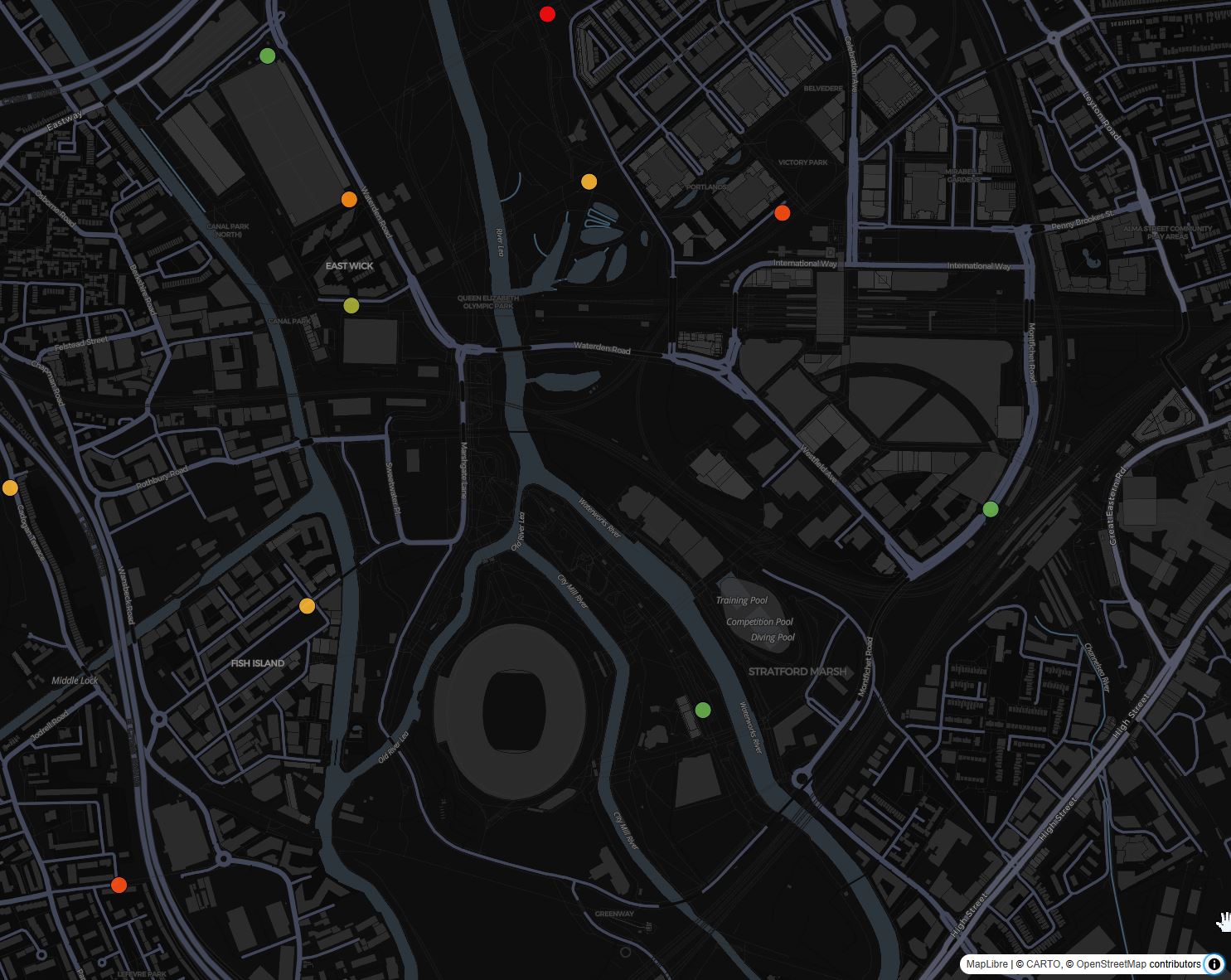
const londonBikes= new ScatterplotLayer({
  id:'london-bikes',
  data:'https://api.citybik.es/v2/networks/santander-cycles',
  dataTransform: d => d.network.stations,
  pickable: true,
      opacity: 0.8,
      stroked: true,
      filled: true,
      radiusScale: 2,
      radiusMinPixels: 10,
      radiusMaxPixels: 150,
      lineWidthMinPixels: 1,
      getPosition: (d) => [d.longitude, d.latitude, 5],
      getRadius: (d) => d.extra.free_bikes,
      getFillColor: (d) => [255, 140, 0],
      getLineColor: (d) => [0, 0, 30],
})
and add it to the MapboxOverlay
const deckOverlay = new MapboxOverlay({
  interleaved: true,
  layers: [
    londonBikes
  ]
});

//Add the layers on the Map
map.addControl(deckOverlay);
map.__deck.props.getCursor = () => map.getCanvas().style.cursor;
Using the D3.js function scaleThreshold it is possible to dynamically change the colours of the docks depending on the number of bikes available. At the top of the script, just before the map initialisation, create a new function const colorScaleFunction
const colorScaleFunction = d3.scaleThreshold()
  .domain([0.15, 0.35, 0.45, 0.55, 0.75]) //% of free bikes
  .range([ //RGB format
    [255, 13, 13], //red
    [255, 78, 17],
    [255, 142, 21],
    [250, 183, 51],
    [172, 179, 52],
    [105, 179, 76], //green
]);
in the londonBikes layer change the getFillColor to
getFillColor: (d) =>colorScaleFunction((d.free_bikes/(d.free_bikes+d.empty_slots))),
To visualise the actual numbers of bikes, we can use the PopUp function of Maplibre. In this example the popup is styled using a CSS Grid.
Update the .maplibregl-popup and add the following styles:
 .maplibregl-popup {
  z-index: 2;
  max-width: 400px;
  min-width: 150px;
  font-size:16px;
  font-family: 'Courier New', Courier, monospace;
  grid-template-columns: auto auto auto;
      grid-template-rows: auto;
      grid-template-areas:
          "icon title title"
          "item-a item-a ."
          "item-b item-b .";
}
.title {
  grid-area: title;
  font-weight: bold;
  margin: 4px;
}
.item-a {
  grid-area: item-a;
  margin: 4px;
}
.item-b {
  grid-area: item-b;
  margin: 4px;
}

.icon {
  grid-area: icon;
  margin: 4px;
  max-width: 20%;
  height: auto;
  place-self: left;
}
Add to the let londonBikes layer the onHover and onClick functions
let londonBikes= new ScatterplotLayer({
id:'london-bikes',
data:'https://api.citybik.es/v2/networks/santander-cycles',
dataTransform: d => d.network.stations,
pickable: true,
opacity: 0.8,
stroked: true,
filled: true,
radiusScale: 2,
radiusMinPixels: 10,
radiusMaxPixels: 150,
lineWidthMinPixels: 1,
getPosition: (d) => [d.longitude, d.latitude, 5],
getRadius: (d) => d.extra.free_bikes,
//getFillColor: (d) => [255, 140, 0],
getFillColor: (d) =>colorScaleFunction((d.free_bikes/(d.free_bikes+d.empty_slots))),
getLineColor: (d) => [0, 0, 30],
onHover: info => {
const {coordinate, object} = info;
if(object){map.getCanvas().style.cursor = 'pointer';}
else{map.getCanvas().style.cursor = 'grab';}
},
onClick: (info) => {
console.log(info);
const {coordinate, object} = info;
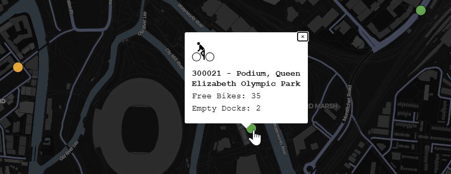
const description = `<img src="https://upload.wikimedia.org/wikipedia/commons/d/d4/Cyclist_Icon_Germany_A1.svg" class='icon'/>
<p class='title'> ${object.name}</p>
<p class='item-a'> Free Bikes: ${object.free_bikes}</p>
<p class='item-b'> Empty Docks: ${object.empty_slots}</p>`;
//MapLibre Popup
new Popup({closeOnClick: false, closeOnMove:true})
.setLngLat(coordinate)
.setHTML(description)
.addTo(map);
}
})
When the user is click on one of the bike docks a pop-up is opening with the icon of a bike, the name of the station and the number of free bikes and empty slots.
We can now access, and further customise, the bike sharing data. In order to update the values in real time, we need to add a final step. At the moment the request is called just once when the map is loaded. In order to update the entire JSON on a predefined interval we need to add a setInterval function at the end of the main.js. The syntax is similar to the setTimeout function, but instead of being executed once, the function is repeated every 20min (in this case)
//Add the layers on the Map
map.addControl(deckOverlay);
map.__deck.props.getCursor = () => map.getCanvas().style.cursor;

const timer = setInterval(() => {
//in case other layers are used, keep them and update just the bike one
const newlayers= deckOverlay._deck.props.layers.map(layer => layer.id === 'london-bikes' ? londonBikes : layer);
deckOverlay.setProps({ //update the layers
       layers:
       newlayers})
 console.log('Data Updated');
}, 1200000); //API called every 20 min => 1200000 ms
The final library we are going to use is ECharts. It is an Open Source solution that provides a large number of options and customisations with detailed examples. From basic line chart to more complex 3D charts and animations, ECharts is an interesting tool to explore and that can be a good addition to improve the legibility, and user engagement, of a web-map and not only.
Stop the local server if it is running and install the package as usual using npm
npm install echarts
Let's create a first standalone chart to familiarise ourselves with the structure of EChart before embedding it to DeckGL.
In a new index.html add the elements container and main in the body of the html and the reference to the mainEcharts.js
<body>
  <div id="container">
    <div id="main"></div>
  </div>
  <script type="module" src="/mainEcharts.js"></script>
</body>
Add a simple stylesheet for two elements named container and main. This can be added also in the index.html file, inside the <head> tag using the style tag
 <style>
    #container {
      position: fixed;
      top: 0;
      left: 0;
      right: 0;
      bottom: 0;
    }

    #main {
      width: 1000px;
      height: 600px;
      margin: auto;
      margin-top: 50px;
    }
  </style>
Moving to the mainEcharts.js
import the Echarts and D3 modules
import * as echarts from 'echarts';
import * as d3 from 'd3';
d3.csv(
  "https://raw.githubusercontent.com/vsigno/publicResources/main/CityData_WUP2018_top20.csv", d3.autoType).then(
  function (CityData) {
    //initialise ECharts in the Div id=main
    var myChartEchart = echarts.init(document.getElementById("main"), {
      width: 1000,
      height: 650
    }); //height is used to avoid cut the text on the Xaxis
The first part of the script is used to parse the dataset using the D3.js function d3.csv and then to initialise the chart in the html element main. Both width and height can be omitted, if not defined the parameter of the CSS style will be used
The chart is then created using a series of options to the initialised object via the function myChartEchart.setOption(option). There are multiple variables and settings that can be used, here we will see some of them but for a complete overview the Option section of the ECharts documentation is a good starting point
 /* An example of 'option' as variable
     //https://echarts.apache.org/en/option.html#series-bar.label
             var labelOption = {
             show: true,
             position: 'inside',
             rotate: 90,
             align: 'left',
             verticalAlign: 'middle',
             fontSize: 12,
             formatter: '{@pop1950} millions',
                 };*/

    // All the settings of the chart are provided in this variable
    var option = {
      title: { //Title and sub-title of the chart
        //ref https://echarts.apache.org/en/option.html#title
        text: "World's Largest Urban Agglomerations 2020",
        textStyle: {
          color: "blue",
          fontSize: 22,
          fontWeight: "bold"
        },
        subtext: "Population data UN World Urbanization Prospects",
        subtextStyle: {
          color: "coral",
          fontWeight: "bold"
        }
      },

      xAxis: { //style of the X
        type: "category",
        axisLabel: {
          interval: 0,
          rotate: 30, //If the label names are too long you can manage this by rotating the label.
          fontSize: 9
        }
      },

      yAxis: { //Style of the Y
        type: "value",
        name: "Population 2020 (millions)",
        nameLocation: "center",
        nameGap: 30,
        nameTextStyle: {
          align: "center"
        },
        splitNumber: 10
      },

      tooltip: { //a tooltip is shown onHover if true
        show: true
      },

      dataset: [ //the actual Dataset
        // ref https://echarts.apache.org/en/option.html#dataset
        {
          source: CityData
        }
      ],
      series: [ //How the dataset is represented
        {
          // ref https://echarts.apache.org/en/option.html#series-bar.type
          type: "bar", //type of chart and style
          showBackground: true,
          itemStyle: {
            color: "#ffcf7d",
            borderColor: "#ffac1f",
            borderWidth: 1.5,
            borderType: "dashed"
          },
          barWidth: "70%",
          //label: labelOption, //option can be coded in external variable, see above. ref https://echarts.apache.org/en/option.html#series-bar.label
          label: { //a label inside the bar
            show: true,
            position: "inside",
            rotate: 90,
            align: "left",
            verticalAlign: "middle",
            fontSize: 12,
            //formatter: '{@pop2035} millions', //pop value as strin
            formatter: function (params) {
              var pop2035_float = parseFloat(params.data.pop2035);

              return pop2035_float.toFixed(2) + ` millions`;
            }
          },
          encode: { //what value is disply on the X, Y and tooltip (based on the header of the CSV file used)
            x: "CityName",
            y: ["pop2020"],
            tooltip: ["pop1950", "pop2020", "pop2035"]
          },

          tooltip: {
            formatter: function (params) {
              //as pop values are strings, we parsed them to Float to better control the number of decimal places
              var pop1950_float = parseFloat(params.data.pop1950);
              var pop2020_float = parseFloat(params.data.pop2020);
              var pop2035_float = parseFloat(params.data.pop2035);

               return (
                `${params.name}<br />
                                  Population 1950 :  ` +
                pop1950_float.toFixed(2) +
                ` millions <br />
                                  Population 2020 :  ` +
                pop2020_float.toFixed(2) +
                ` millions <br />
                                  Population 2035 :  ` +
                pop2035_float.toFixed(2) +
                ` millions`

              );


            }
          },
          animationDuration: 2000,
          animationEasing: "elasticOut" //https://echarts.apache.org/examples/en/editor.html?c=line-easing
        }
      ]
    };

    // All the above is applied to the chart
    myChartEchart.setOption(option);
  }
);
To apply the various options to the chart we use the function setOption. The result is an animated and interactive bar chart that can be embedded in our website.
The use of ECharts in DeckGL is straightforward. The chart can be added in any position of the web-map: it could be on top of it (in this case the div element where the map is created needs to be placed outside the container element of the map) or, as we are going to see, inside the popup triggered by the onClick function.
Install the Echarts library
npm install echarts
In the last index.html created for Real Time data with DeckGL, add the ECharts library to the main.js
import * as echarts from 'echarts';
The CSS of the popup need to be updated as we need an additional row item-c on the grid-template-areas
grid-template-areas:
  "icon title title"
  "item-a item-a ."
  "item-b item-b ."
  "item-c item-c item-c";
add the a new style for the element item-c
#item-c {
  grid-area: item-c;
  margin: 4px;
  height: 300px;
}
Then, we need to change the PopUp description to add a new div id='item-c'
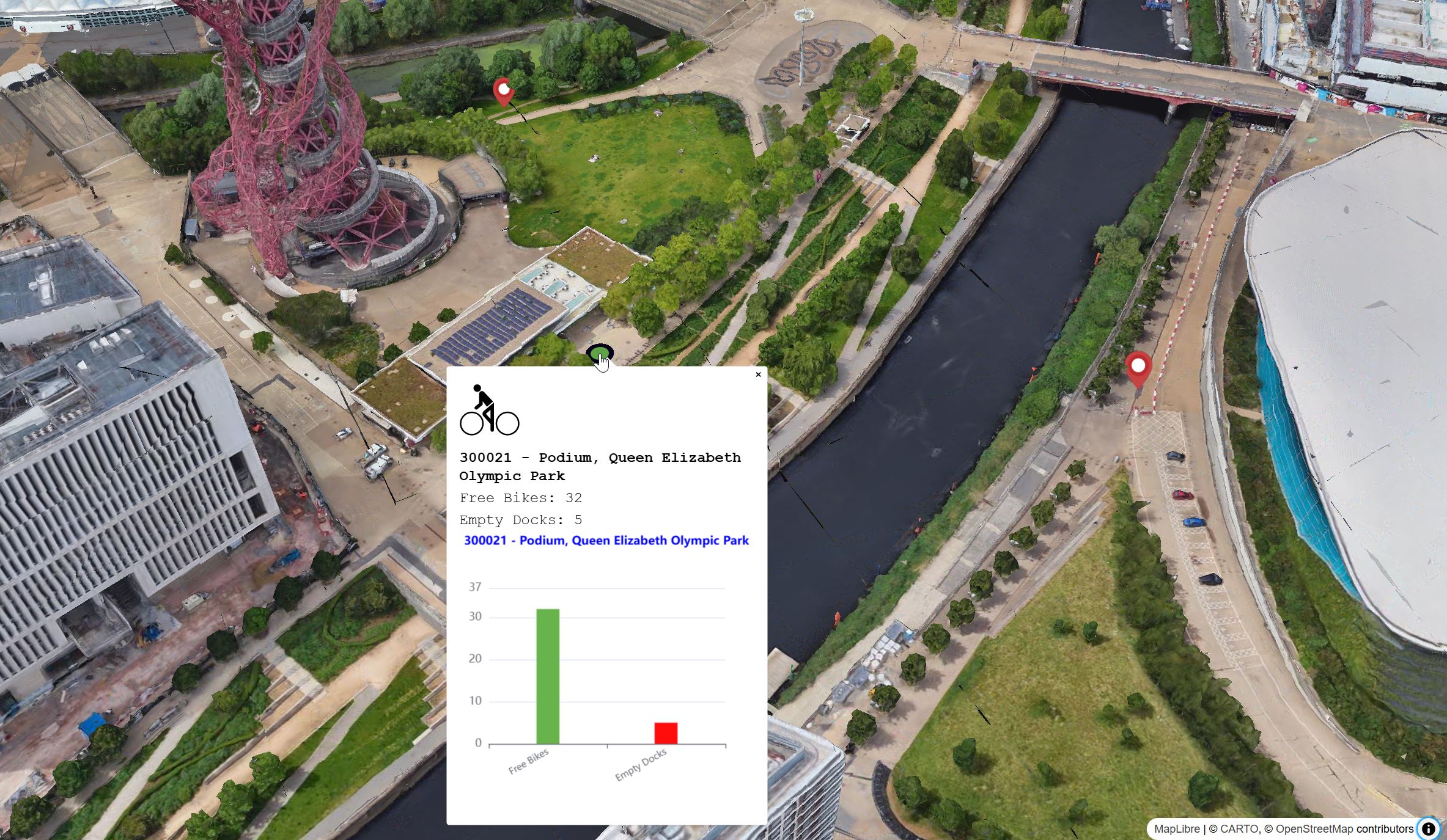
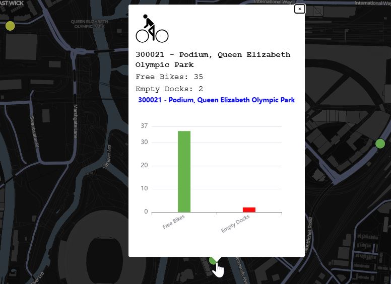
 onClick: (info) => {
        console.log(info);
        const {coordinate, object} = info;
        console.log(object);
        const description = `<img src="https://upload.wikimedia.org/wikipedia/commons/d/d4/Cyclist_Icon_Germany_A1.svg" class='icon'/>
        <p class='title'> ${object.name}</p>
        <p class='item-a'> Free Bikes: ${object.free_bikes}</p>
        <p class='item-b'> Empty Docks: ${object.empty_slots}</p>
        <div id='item-c'></div>
        `;

const popup = document.getElementsByClassName('maplibregl-popup');
if ( popup.length ) {popup[0].remove();}

        new Popup({closeOnClick: false, closeOnMove:true})
            .setLngLat(coordinate)
            .setHTML(description)
            .addTo(map);

        chart(object);
  }
The new div is the placeholder for the chart. In case a popup is already open, it will be remove from the page (this avoid to have the wrong item-c updated). The Popup is then created.
The function chart(object) is passing to EChart the object clicked by the user. As the object is already a JSON structure, we do not need to use D3.js to pass the values to the chart as we did in the previous section. In the chart function the first step is to initialise ECharts on the element with id item-c
The function can be added at the end of the main.js, after the map.addControl(deckOverlay);
function chart(dataset) {
  var myChartEchart = echarts.init(document.getElementById("item-c"));
The JSON response, in this case named dataset, is now accessible by the function chart
    var option = {
      title: {
        text:dataset.name,
        textStyle: {
          color: "blue",
          fontSize: '0.8em',
          fontWeight: "bold"
        },
      },
using the respective keys the options can be populated using the JSON response (e.g. in this example the title of the chart uses the commonName of the bike station)
    xAxis: {
      type: "category",
      data:['Free Bikes', 'Empty Docks'],
      axisLabel: {
        interval: 0,
        rotate: 30, //If the label names are too long you can manage this by rotating the label.
        fontSize: 10
      }
    },

    yAxis: {
      type: "value",
      min:0,
      max: dataset.free_bikes+dataset.empty_slots>0 ? dataset.free_bikes+dataset.empty_slots : 1,
      nameLocation: "center",
      nameTextStyle: {
        align: "center"
      },
  },
In this case the keys for the free bikes and empty docks are not immediately intelligible, thus the text for these labels is manually encoded using the data array ([‘Free Bikes', ‘Empty Docks']).
series: [
  {
    type: 'bar',
    barWidth: 25,
    data: [
      {
        value: dataset.free_bikes,
        itemStyle: {color:'rgb('+colorScaleFunction((dataset.free_bikes/(dataset.free_bikes+dataset.empty_slots)))+')'}
      },
      {
        value: dataset.empty_slots,
        itemStyle: {color:'rgb('+colorScaleFunction((dataset.empty_slots/(dataset.free_bikes+dataset.empty_slots)))+')'}
      }
    ]
  }
  ]
}
Finally, we can add the series: the type of chart to use (i.e. bar) and the data to to visualise (i.e. value). To further customise the visualisation, it is possible to pass conditional operations to style the single elements of the charts, in this example, the bars change colour from green to red depending on the value of the free bikes or empty docks
The last step is to set the options on the charts
   myChartEchart.setOption(option);
  }
We can now build and publish the web visualisation as an actual website. As we are using some features that are not supported by older browser (e.g. top-level-await Internet Explorer) we need to tell ViteJS to ignore certain errors.
In the main folder of the project, create a new file named vite.config.js
export default ({
  esbuild: {
    supported: {
      'top-level-await': true
    },
  },
  base: '',
  // plugins: [
  //   basicSsl() //not needed in production
  // ]
});
We can now run the command npm run build. If the local server is running, stop it using CTRL+C or Option+C
ViteJS will create a new dist folder that contains the build website. To test it locally, we can use the command npm run preview.
DeckGL provide support to the Google 3DTiles. This basemap provide high resolution models using the highly efficient opensource 3DTiles format.
There are two main approaches to access Google 3DTiles:
- using the Google Map Tiles API
- using a CESIUM Account
Both solutions access the same endpoint and same free tier, however, Google Map Tiles API require a billing method, while the CESIUM approach not.
At the time of writing, the CesiumIONLoader used to load Cesium dataset in DeckGL doesn't support directly the native request to the Google Tiles, so a workaround is needed to load them.
- if present remove or comment out the 3D buildings layers
- build a request, using the fetch function to obtain the endpoint url from the CESIUM access token, just after the
imports
///create request
let CESIUM_EndPoint="https://api.cesium.com/v1/assets/2275207/endpoint" //Google 3D Tiles endpoint
let CESIUM_AccessToken="CESIUM Access Token from the ION Dashboard"

let Cesium_GTiles

async function fetchRemoteJSON(inputData) {
  const response = await fetch(inputData);
  const dataJson = await response.json();
  return dataJson;
}

await fetchRemoteJSON(CESIUM_EndPoint+"?access_token="+CESIUM_AccessToken)
.then(dataJson => {Cesium_GTiles=dataJson; console.log(Cesium_GTiles.options.url);
});
- we use the result url with the
DeckGL Tile3Dlayer(to be imported at the top of themain.jsfile from@deck.gl/geo-layers)
import {Tile3DLayer} from '@deck.gl/geo-layers';
Define a new Tile3DLayer layer and add it to the MapboxOverlay layer
const tilesGM= new Tile3DLayer({
  id: 'tiles',
  data: Cesium_GTiles.options.url,//this is the url returned by the fetch request
})

const deckOverlay = new MapboxOverlay({
  interleaved: true,
    layers: [
    //[..other layers..]
    tilesGM
  ]
})
It is possible to overlay Deck Layers, such as the IconLayer, on the 3DTiles by using the experimental TerrainExtension module. After installing the module using npm install '@deck.gl/extensions', we can add the import {_TerrainExtension as TerrainExtension} from '@deck.gl/extensions'; on the top of the main.js file.
To activate the extension we need to add the operation:'terrain+draw' to the 3Dtiles layer
const tilesGM= new Tile3DLayer({
  id: 'tiles',
  data: Cesium_GTiles.options.url,
  operation: 'terrain+draw' //removing the draw will not rendering the tiles
})
Then, for each layers we want to offset by the terrain, we need to add the prop extensions: [new TerrainExtension()]. For example:
let layerBatLocation=new IconLayer({
  id:'icons',
  pickable:true,
  data:'./location.geojson',
  dataTransform:d=>d.features.filter(f=>f.geometry !=null), //just be sure that every feature has a geometry
  getPosition:f=>f.geometry.coordinates,
  getIcon: d => 'marker', //need to match the key in `iconMapping`
  getSize: 35,
  iconAtlas: 'https://upload.wikimedia.org/wikipedia/commons/e/ed/Map_pin_icon.svg',
  iconMapping: {marker: {x: 0, y: 0, width: 94, height: 128, anchorY: 128, mask:false}},
  extensions:[new TerrainExtension()],
  })