This tutorial is based on one of Google's original Flutter codelabs, now no longer available although an archived version can be found here
If you have worked through part 1 of this codelab, you already have the starting app, startup_namer. Previously you developed a simple mobile app that generates an endless list of proposed names for a startup company.
By the end of this codelab, the user can select and unselect names, saving the best ones. Tapping the list icon in the upper right of the app bar navigates to a new page (called a route) that lists only the favorited names.
The animated GIF shows how the finished app works.
In this step, you'll add heart icons to each row. In the next step, you'll make them tappable and save the favorites.
Add a _saved Set to RandomWordsState. This Set stores the word pairings that the user favorited. Set is preferred to List because a properly implemented Set does not allow duplicate entries.
class RandomWordsState extends State<RandomWords> {
  final List<WordPair> _suggestions = <WordPair>[];
  final Set<WordPair> _saved = new Set<WordPair>();   // Add this line.
  final TextStyle _biggerFont = const TextStyle(fontSize: 18.0);
  ...
}
In the _buildRow function, add an alreadySaved check to ensure that a word pairing has not already been added to favorites
Widget _buildRow(WordPair pair) {
  final bool alreadySaved = _saved.contains(pair);  // Add this line.
  ...
}
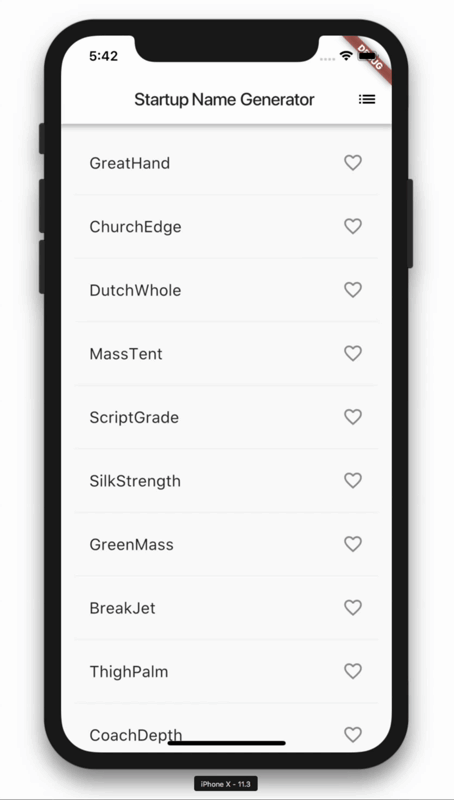
In _buildRow() you'll also add heart-shaped icons to the ListTile objects to enable favoriting. In the next step, you'll add the ability to interact with the heart icons.
Add the icons, as shown below:
Widget _buildRow(WordPair pair) {
  final bool alreadySaved = _saved.contains(pair);
  return new ListTile(
    title: new Text(
      pair.asPascalCase,
      style: _biggerFont,
    ),
    trailing: new Icon(   // Add the lines from here...
      alreadySaved ? Icons.favorite : Icons.favorite_border,
      color: alreadySaved ? Colors.red : null,
    ),                    // ... to here.
  );
}
Hot reload the app. You should now see open hearts on each row, but they are not yet interactive.
In this step, you'll make the heart icons tappable. When the user taps an entry in the list, toggling its "favorited" state, that word pairing is added or removed from a set of saved favorites.
To do this, you'll modify the _buildRow function. If a word entry has already been added to favorites, tapping it again removes it from favorites. When a tile has been tapped, the function calls setState() to notify the framework that state has changed.
Add onTap, as shown below:
Widget _buildRow(WordPair pair) {
  final alreadySaved = _saved.contains(pair);
  return new ListTile(
    title: new Text(
      pair.asPascalCase,
      style: _biggerFont,
    ),
    trailing: new Icon(
      alreadySaved ? Icons.favorite : Icons.favorite_border,
      color: alreadySaved ? Colors.red : null,
    ),
    onTap: () {      // Add 9 lines from here...
      setState(() {
        if (alreadySaved) {
          _saved.remove(pair);
        } else {
          _saved.add(pair);
        }
      });
    },               // ... to here.
  );
}
Note in Flutter's reactive style framework, calling setState() triggers a call to the build() method for the State object, resulting in an update to the UI.
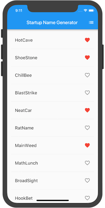
Hot reload the app. You should be able to tap any tile to favorite, or unfavorite, the entry. Tapping a tile generates an implicit ink splash animation emanating from the tap point.
In this step, you'll add a new page (called a route in Flutter) that displays the favorites. You'll learn how to navigate between the home route and the new route.
In Flutter, the Navigator manages a stack containing the app's routes. Pushing a route onto the Navigator's stack, updates the display to that route. Popping a route from the Navigator's stack, returns the display to the previous route.
Next, you'll add a list icon to the AppBar in the build method for RandomWordsState. When the user clicks the list icon, a new route that contains the saved favorites is pushed to the Navigator, displaying the icon.
Add the icon and its corresponding action to the build method:
 class RandomWordsState extends State<RandomWords> {
  ...
  @override
  Widget build(BuildContext context) {
    return new Scaffold(
      appBar: new AppBar(
        title: new Text('Startup Name Generator'),
        actions: <Widget>[      // Add 3 lines from here...
          new IconButton(icon: const Icon(Icons.list), onPressed: _pushSaved),
        ],                      // ... to here.
      ),
      body: _buildSuggestions(),
    );
  }
  ...
}
Add a _pushSaved() function to the RandomWordsState class.
 void _pushSaved() {
  }
Hot reload the app. The list icon ( ) appears in the app bar. Tapping it does nothing yet, because the
 _pushSaved function is empty.
Next, you'll build a route and push it to the Navigator's stack. This action changes the screen to display the new route. The content for the new page is built in MaterialPageRoute's builder property, in an anonymous function.
Call Navigator.push, as shown below, which pushes the route to the Navigator's stack. The IDE will complain about invalid code, but you will fix that in the next section.
void _pushSaved() {
  Navigator.of(context).push(
  );
}
Next, you'll add the MaterialPageRoute and its builder. For now, add the code that generates the ListTile rows. The divideTiles() method of ListTile adds horizontal spacing between each ListTile. The divided variable holds the final rows, converted to a list by the convenience function, toList().
Add the code, as shown below:
void _pushSaved() {
  Navigator.of(context).push(
    new MaterialPageRoute<void>(   // Add 20 lines from here...
      builder: (BuildContext context) {
        final Iterable<ListTile> tiles = _saved.map(
          (WordPair pair) {
            return new ListTile(
              title: new Text(
                pair.asPascalCase,
                style: _biggerFont,
              ),
            );
          },
        );
        final List<Widget> divided = ListTile
          .divideTiles(
            context: context,
            tiles: tiles,
          )
          .toList();
      },
    ),                           // ... to here.
  );
}
The builder property returns a Scaffold, containing the app bar for the new route, named "Saved Suggestions." The body of the new route consists of a ListView containing the ListTiles rows; each row is separated by a divider.
Add horizontal dividers, as shown below:
void _pushSaved() {
  Navigator.of(context).push(
    new MaterialPageRoute<void>(
      builder: (BuildContext context) {
        final Iterable<ListTile> tiles = _saved.map(
          (WordPair pair) {
            return new ListTile(
              title: new Text(
                pair.asPascalCase,
                style: _biggerFont,
              ),
            );
          },
        );
        final List<Widget> divided = ListTile
          .divideTiles(
            context: context,
            tiles: tiles,
          )
              .toList();

        return new Scaffold(         // Add 6 lines from here...
          appBar: new AppBar(
            title: const Text('Saved Suggestions'),
          ),
          body: new ListView(children: divided),
        );                           // ... to here.
      },
    ),
  );
}
Hot reload the app. Favorite some of the selections and tap the list icon in the app bar. The new route appears containing the favorites. Note that the Navigator adds a "Back" button to the app bar. You did not have to explicitly implement Navigator.pop. Tap the back button to return to the home route.
In this step, you'll modify the app's theme. The theme controls the look and feel of your app. You can either use the default theme, which is dependent on the physical device or emulator, or customize the theme to reflect your branding.
You can easily change an app's theme by configuring the
ThemeData class. This app currently uses the default theme, but you'll change the app bars background color to white and the foreground color (the text) to black.
Change the color in the MyApp class:
class MyApp extends StatelessWidget {
  @override
  Widget build(BuildContext context) {
    return new MaterialApp(
      title: 'Startup Name Generator',
      theme: ThemeData(               // Add the 3 lines from here...
        appBarTheme: AppBarTheme(backgroundColor: Colors.white, foregroundColor: Colors.black),
      ),                              // ... to here.
      home: new RandomWords(),
    );
  }
}
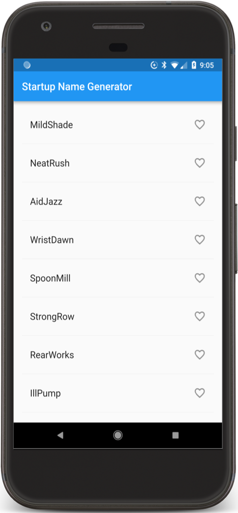
Hot reload the app. The app bar is now white (see below).
As an exercise for the reader, use ThemeData to change other aspects of the UI. The Colors class in the Material library provides many color constants you can play with, and hot reload makes experimenting with the UI quick and easy.